-
Property & Casualty
Property & Casualty Overview

Property & Casualty
We offer a full range of reinsurance products and the expertise of our talented reinsurance team.
Expertise
Publication
Structured Settlements – What They Are and Why They Matter
Publication
PFAS Awareness and Concern Continues to Grow. Will the Litigation it Generates Do Likewise?
Publication
“Weather” or Not to Use a Forensic Meteorologist in the Claims Process – It’s Not as Expensive as You Think
Publication
Phthalates – Why Now and Should We Be Worried?
Publication
The Hidden Costs of Convenience – The Impact of Food Delivery Apps on Auto Accidents
Publication
That’s a Robotaxi in Your Rear-View Mirror – What Does This Mean for Insurers? -
Life & Health
Life & Health Overview

Life & Health
We offer a full range of reinsurance products and the expertise of our talented reinsurance team.

Publication
Key Takeaways From Our U.S. Claims Fraud Survey
Publication
Favorite Findings – Behavioral Economics and Insurance
Publication
Individual Life Accelerated Underwriting – Highlights of 2024 U.S. Survey
Publication
Can a Low-Price Strategy be Successful in Today’s Competitive Medicare Supplement Market? U.S. Industry Events
Publication
The Latest in Obstructive Sleep Apnea -
Knowledge Center
Knowledge Center Overview

Knowledge Center
Our global experts share their insights on insurance industry topics.
Trending Topics -
About Us
About Us OverviewCorporate Information

Meet Gen Re
Gen Re delivers reinsurance solutions to the Life & Health and Property & Casualty insurance industries.
- Careers Careers
Improving Accelerated Underwriting Results by Putting Behavioral Economics Into Action

July 19, 2021
Heidi Alpren
English
Español
Over the past several years, the concept of Behavioral Economics has turned mainstream, even as it challenges the very foundation of traditional economic thinking by introducing the concept of dual system thinking (“fast” and “slow”). Behavioral Economics is defined as “the study of psychology as it relates to the economic decision-making processes of individuals and institutions.”1
In a parallel fashion, Life insurers have taken a fresh look at their established traditional underwriting practices as they consider and implement streamlined accelerated underwriting (AU) options, removing the need for paramedical exams and/or fluid collection for qualified applicants.
Applying Behavioral Economics to AU
Given the many benefits of AU – including decreasing time from application to issue and improving the experience of qualified customers – there are many favorable impacts. However, given the more streamlined nature of the process, it also has an increased potential for material misrepresentation, anti-selection and fraud. As the list of carriers embracing the benefits of AU continues to grow, so does the need for a methodical and targeted approach to designing related applications and personal health information (PHI) scripts.
By implementing a toolkit using Behavioral Economics (BE) approaches, carriers can offset some of the challenges of AU and promote improved disclosure of medical conditions in the application process.
Gen Re has conducted several BE‑focused studies on application disclosure. We’ve found that widely used, open-ended question formats are less effective than other designs (see earlier article).
Based on carriers’ interest and experience in AU, our most recent BE experiment was inspired by “real life” examples – current applications used by Individual Life carriers in the marketplace today, including many who are currently offering AU.2
Three Key Takeaways for Using BE
Our latest BE experiment resulted in three key takeaways:

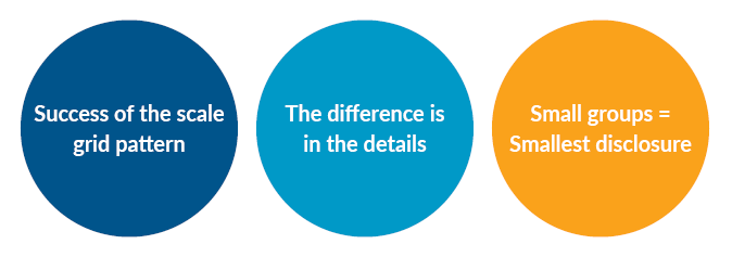
1 – Success of the scale grid pattern
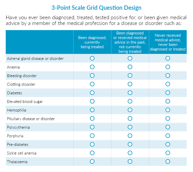
From Gen Re’s earlier studies, we learned that the scale grid pattern is the most effective in encouraging greater medical condition disclosure, and this result was further highlighted in our latest experiment. Questions with either 3- or 5‑point scale grid designs prompted the highest level of condition disclosure, with over 80% of respondents reporting any condition, compared to results as low as 55% for other treatment groups tested. While both scale grid designs were deemed effective, the 3‑point scale had a slightly stronger impact, providing an alternative for those who are concerned about the relative size of the question on the application, especially when using a cell phone or other mobile device to complete. The average time spent on the scale grid design questionnaires was higher than other treatment groups, which may be due to the increased focus needed while completing.

2 – The difference is in the details
When implementing BE methods, it’s clear that small changes can make a big difference. We tested two treatment groups, both using “Yes/No” checkboxes followed by several conditions available to select from. However, one treatment group stated up front that the individual must provide details for any “Yes” answer. For the other group, applicants were not made aware that details would need to be provided until all questions were answered. The results clearly showed that the simple change of holding off to ask about details until after they had selected conditions resulted in a higher level of condition disclosure.
3 – Small groups = Smallest disclosure
A question design showing smaller groups of conditions followed by “Yes/No” checkboxes was not as effective at increasing condition disclosure as compared to other options, including a more expanded list of singular conditions with “Yes/No” checkboxes. This may be due to lower engagement and thoroughness on the part of the respondents, as the average time to complete was the lowest across all groups tested.

Cognitive Load
Gen Re actively employed another BE approach, adding a cognitive task after the individuals had completed the application. We presented an exercise with eight scrambled words (only four represented actual words) and asked respondents to unscramble the list. We took this approach to test the hypothesis that questions requiring more work to complete would place a greater cognitive load on the individual completing the application.
In our study, over half of respondents were able to correctly “unscramble” the four words, no matter the question design. However, the 5‑point scale grid pattern mentioned above received the highest percentage (60%) answering correctly, suggesting that the increased time to complete this design does not impact the level of engagement.
Other Ways to Put BE Into Action
There are other applications where BE approaches can be helpful in the AU space. This includes:
- Displaying copy next to form fields to help and explain
- Using arrows to direct eye gaze to key points
- Utilizing visual borders to lessen “choice overload” that may impair an individual’s processing of the information shared
Endnote
- www.investopedia.com
- Study details: Gen Re’s latest Application Disclosure Study was conducted in 2020. Over 3,300 online Individual Life insurance applications were completed in our study by U.S. residents ages 30‑75. The experiment included six treatment groups and one control group. Twelve different medical condition groupings were tested. The process was hypothetical; however, to replicate the financial benefit an individual may receive from non-disclosure on an application, respondents were told they may be able to participate in another brief survey for more credits if they are considered healthy.
Sources
- Galfano G, et al. Eye Gaze Cannot Be Ignored (but Neither Can Arrows). Quarterly Journal of Experimental Psychology (2006), U.S. National Library of Medicine, pubmed.ncbi.nlm.nih.gov/22512343.
- Cutright, KM, The Beauty of Boundaries: When and Why We Seek Structure in Consumption, Journal of Consumer Research, 38 (5), 775‑790, (2012).


